Format on Sencha Touch 2
In Sencha Touch 2, DataView component is used to display the set of same component many times. For examples in apps like these:
Create a Store
First, we are going to create a Store that contains Headline, Content, Author as fields usingfields configuration and array of Objects using data configuration. For Demonstration purpose, i added Sencha Components with descriptions as array of objects.
Ext.define('MyApp.store.ArticleStore', {
extend: 'Ext.data.Store',
alias: 'store.articlestore',
config: {
data: [
{
Headline: 'Panel',
Author: 'Sencha',
Content: 'Panels are most useful as Overlays - containers that float over your appl..'
},
{
Headline: 'FormPanel',
Author: 'Sencha',
Content: 'The Form panel presents a set of form fields and provides convenient ways..'
},
{
Headline: 'Component',
Author: 'Sencha',
Content: 'Most of the visual classes you interact with in Sencha Touch are Componen..'
},
{
Headline: 'Store',
Author: 'Sencha',
Content: 'he Store class encapsulates a client side cache of Model objects. Stores..'
},
{
Headline: 'Model',
Author: 'Sencha',
Content: 'A Model represents some object that your application manages. For example..'
},
{
Headline: 'Controller',
Author: 'Sencha',
Content: 'Controllers are responsible for responding to events that occur within yo..'
}
],
storeId: 'articlestore',
fields: [
{
name: 'Headline'
},
{
name: 'Content'
},
{
name: 'Author'
}
]
}
});
Creating a DataView Component
Now, we are going to create a DataView component with toolbar positioned top using dockedproperty.Also we have assigned the above registered store (ArticleStore) to the DataView usingstoreId configuration.
Using itemTpl configuration, we are defining the HTML Template with variables wrapped inside curly braces{}. The values for these variables are already defined in store using dataconfiguration.
Each data items from the Store will be looped and displayed as items in the DataView using theitemTpl configuration. In itemCls configuration, we are defining the CSS Class that needs to apply for each item in dataview.
Ext.define('MyApp.view.MyContainer', {
extend: 'Ext.Container',
config: {
items: [
{
xtype: 'dataview',
height: '100%',
styleHtmlContent: true,
width: '100%',
layout: {
type: 'fit'
},
inline: {
wrap: true
},
itemCls: 'dataview-item',
itemTpl: [
'<div >',
' {Headline}',
'</div>',
'<div >',
' {Author}',
'</div>',
'<div >',
' {Content}',
'</div>'
],
store: 'articlestore'
},
{
xtype: 'toolbar',
docked: 'top',
title: 'Summary'
}
]
}
});
CSS Styles
CSS Class definitions that we added in itemTpl configuration.
.dataview-item{
width : 33.33%;
height : 50%;
border-right: 1px solid #000;
border-bottom: 5px solid #59535E;
float:left;
padding:2px;
}
.arHeadline{
font-size: 16px;
font-weight:bold;
overflow:hidden;
font-family: 'Museo Sans';
color: #66ab16;
}
.arbyline{
font-size:10px;
font-style:italic;
font-family: 'Museo Sans';
}
.arcontent{
font-size:12px;
font-family: 'Museo Sans';
margin: 2px;
overflow: hidden;
}
When we run this code in Google Chrome, Following is the output
In Sencha Touch 2, DataView component is used to display the set of same component many times. For examples in apps like these:
- List of messages in an email app
- Showing latest news/tweets
- Tiled set of albums in an HTML5 music player
Create a Store
First, we are going to create a Store that contains Headline, Content, Author as fields usingfields configuration and array of Objects using data configuration. For Demonstration purpose, i added Sencha Components with descriptions as array of objects.
Ext.define('MyApp.store.ArticleStore', {
extend: 'Ext.data.Store',
alias: 'store.articlestore',
config: {
data: [
{
Headline: 'Panel',
Author: 'Sencha',
Content: 'Panels are most useful as Overlays - containers that float over your appl..'
},
{
Headline: 'FormPanel',
Author: 'Sencha',
Content: 'The Form panel presents a set of form fields and provides convenient ways..'
},
{
Headline: 'Component',
Author: 'Sencha',
Content: 'Most of the visual classes you interact with in Sencha Touch are Componen..'
},
{
Headline: 'Store',
Author: 'Sencha',
Content: 'he Store class encapsulates a client side cache of Model objects. Stores..'
},
{
Headline: 'Model',
Author: 'Sencha',
Content: 'A Model represents some object that your application manages. For example..'
},
{
Headline: 'Controller',
Author: 'Sencha',
Content: 'Controllers are responsible for responding to events that occur within yo..'
}
],
storeId: 'articlestore',
fields: [
{
name: 'Headline'
},
{
name: 'Content'
},
{
name: 'Author'
}
]
}
});
Creating a DataView Component
Now, we are going to create a DataView component with toolbar positioned top using dockedproperty.Also we have assigned the above registered store (ArticleStore) to the DataView usingstoreId configuration.
Using itemTpl configuration, we are defining the HTML Template with variables wrapped inside curly braces{}. The values for these variables are already defined in store using dataconfiguration.
Each data items from the Store will be looped and displayed as items in the DataView using theitemTpl configuration. In itemCls configuration, we are defining the CSS Class that needs to apply for each item in dataview.
Ext.define('MyApp.view.MyContainer', {
extend: 'Ext.Container',
config: {
items: [
{
xtype: 'dataview',
height: '100%',
styleHtmlContent: true,
width: '100%',
layout: {
type: 'fit'
},
inline: {
wrap: true
},
itemCls: 'dataview-item',
itemTpl: [
'<div >',
' {Headline}',
'</div>',
'<div >',
' {Author}',
'</div>',
'<div >',
' {Content}',
'</div>'
],
store: 'articlestore'
},
{
xtype: 'toolbar',
docked: 'top',
title: 'Summary'
}
]
}
});
CSS Styles
CSS Class definitions that we added in itemTpl configuration.
.dataview-item{
width : 33.33%;
height : 50%;
border-right: 1px solid #000;
border-bottom: 5px solid #59535E;
float:left;
padding:2px;
}
.arHeadline{
font-size: 16px;
font-weight:bold;
overflow:hidden;
font-family: 'Museo Sans';
color: #66ab16;
}
.arbyline{
font-size:10px;
font-style:italic;
font-family: 'Museo Sans';
}
.arcontent{
font-size:12px;
font-family: 'Museo Sans';
margin: 2px;
overflow: hidden;
}
When we run this code in Google Chrome, Following is the output
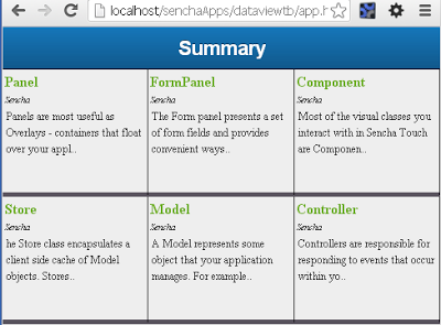
You will be able to see the DataView components are displayed horizontally one after another in Table Format.
—————————————————-
Posted By :
Manish Kumar Choithani
Senior /Lead Architect
Reference Email Ids:
[email protected]
[email protected]
[email protected]
[email protected]
—————————————————-
Posted By :
Manish Kumar Choithani
Senior /Lead Architect
Reference Email Ids:
[email protected]
[email protected]
[email protected]
[email protected]
 RSS Feed